Title: Name Project
Course: Digital Photography
Artist: Alyssa Stults
Teacher: Mrs. Gollan
Subject Matter: Letters of my name found downtown
Medium: Digital Photography
Project Goal: Spell out my name with items that look like each letter of my name
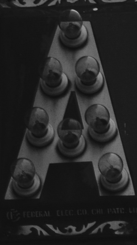
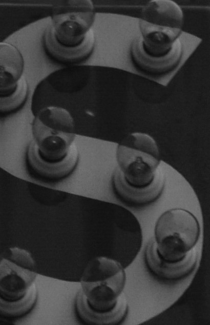
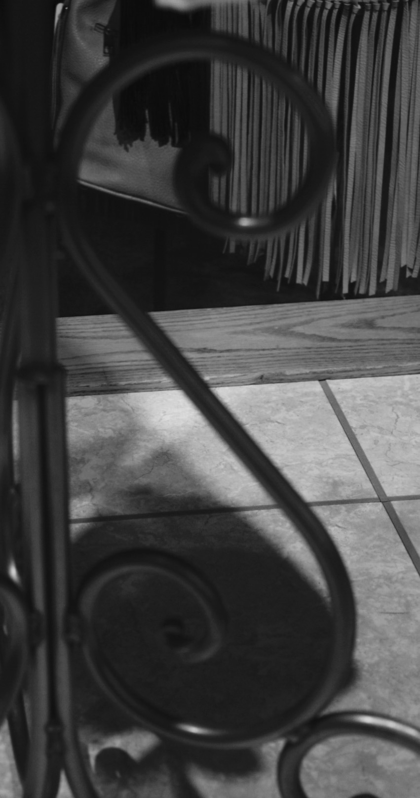
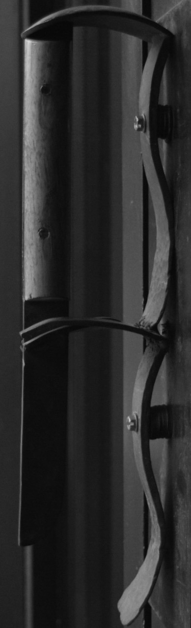
Personal Review/Evaluation and Critique: I feel like the shapes of the letters I used for my project fit my name well. They are not to sharp or blurry. Also, the different textures of the items I used for my pictures make the project more interesting. The spaces between the letters is just enough that each letter is readable, but not squished together. In my name project, I tried to balance my letters by not putting similar looking pictures (two blocky ones) beside each other if I could help it. Also, there is emphasis on the first A and first S in my name. This doesn't wreck the balance, but makes the letters stick out a little bit. I did not like that the letters in my name were hard to find downtown while trying to do this project. It took me a while to complete all 6 letters in my name because of this. The areas that I need to work on in this project are getting the correct angle and taking more quality pictures. When photographing for this project, I did well centering most of the items in my pictures so that I could easily crop them to fit. I tried my best to get down to the level of the item I was photographing for the best results. During this project, I learned how to successfully paste the pictures right next to each other without a space. If I could do this project differently, I would have chosen a brighter day to take my pictures. Also, I would have taken more time to wander around.
Course: Digital Photography
Artist: Alyssa Stults
Teacher: Mrs. Gollan
Subject Matter: Letters of my name found downtown
Medium: Digital Photography
Project Goal: Spell out my name with items that look like each letter of my name
Personal Review/Evaluation and Critique: I feel like the shapes of the letters I used for my project fit my name well. They are not to sharp or blurry. Also, the different textures of the items I used for my pictures make the project more interesting. The spaces between the letters is just enough that each letter is readable, but not squished together. In my name project, I tried to balance my letters by not putting similar looking pictures (two blocky ones) beside each other if I could help it. Also, there is emphasis on the first A and first S in my name. This doesn't wreck the balance, but makes the letters stick out a little bit. I did not like that the letters in my name were hard to find downtown while trying to do this project. It took me a while to complete all 6 letters in my name because of this. The areas that I need to work on in this project are getting the correct angle and taking more quality pictures. When photographing for this project, I did well centering most of the items in my pictures so that I could easily crop them to fit. I tried my best to get down to the level of the item I was photographing for the best results. During this project, I learned how to successfully paste the pictures right next to each other without a space. If I could do this project differently, I would have chosen a brighter day to take my pictures. Also, I would have taken more time to wander around.
